
SHAPE A GRAND TOMORROW
Paradox Development Studio invites you to build your ideal society in the tumult of the exciting and transformative 19th century. Balance the competing interests in your society and earn your place in the sun in Victoria 3, one of the most anticipated games in Paradox’s history.THE ULTIMATE SOCIETY SIMULATOR
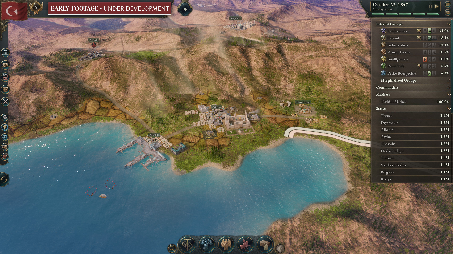
- Lead dozens of world nations from 1836-1936. Agrarian or Industrial, Traditional or Radical, Peaceful or Expansionist... the choice is yours.
- Detailed population groups with their own economic needs and political desires.
- Reform your government and constitution to take advantage of new social innovations, or preserve the stability of your nation by holding fast to tradition in the face of revolutionaries.
- Research transformative new technology or ideas to improve your national situation.
DEEP ECONOMIC SYSTEM
- Expand your industry to take advantage of lucrative goods, taxing the profits to improve national prosperity.
- Import cheap raw materials to cover your basic needs while finding new markets for your finished goods.
- Secure vital goods to fuel your advanced economy and control the fate of empires.
- Balance employing available labor force with the needs for new types of workers.
PLAY ON A GRAND STAGE
- Use your diplomatic wiles to weave a tangled global web of pacts, relations, alliances, and rivalries to secure your diplomatic position on the world stage.
- Employ threats, military prowess and bluffs to persuade enemies to back down in conflicts.
- Increase your economic and military strength at the expense of rivals.
- Accumulate prestige and the respect of your rivals as you build an industrial giant at home or an empire abroad.

Hello all, today we are going to talk about some of the data visualization in Victoria 3, how we on the team have iterated on it since our UX dev diary and what we think through when talking about such iterations.
Aron is very busy doing what last bits of polish can be done before we lock down the game for release certification, so I have been asked to write this dev diary for you in their stead. Im not officially a UX Designer but I do have my qualifications in user experience as QA and I also am quite opinionated about pie charts and other forms of data visualization as many of you in the community are no doubt aware of. I regularly get to be Aron and Henriks rubber duck as we talk through solutions to problems on the UX side and it's part of my job that I thoroughly enjoy.
(In fact the first draft of this diary was a full thesis on why pie charts are bad, but I was encouraged to tone down the rhetoric a little, so I will conclude they are aesthetically pretty but are horrible for conveying data.)
Just how angry is Paul? Even with the visualization you would still be guessing
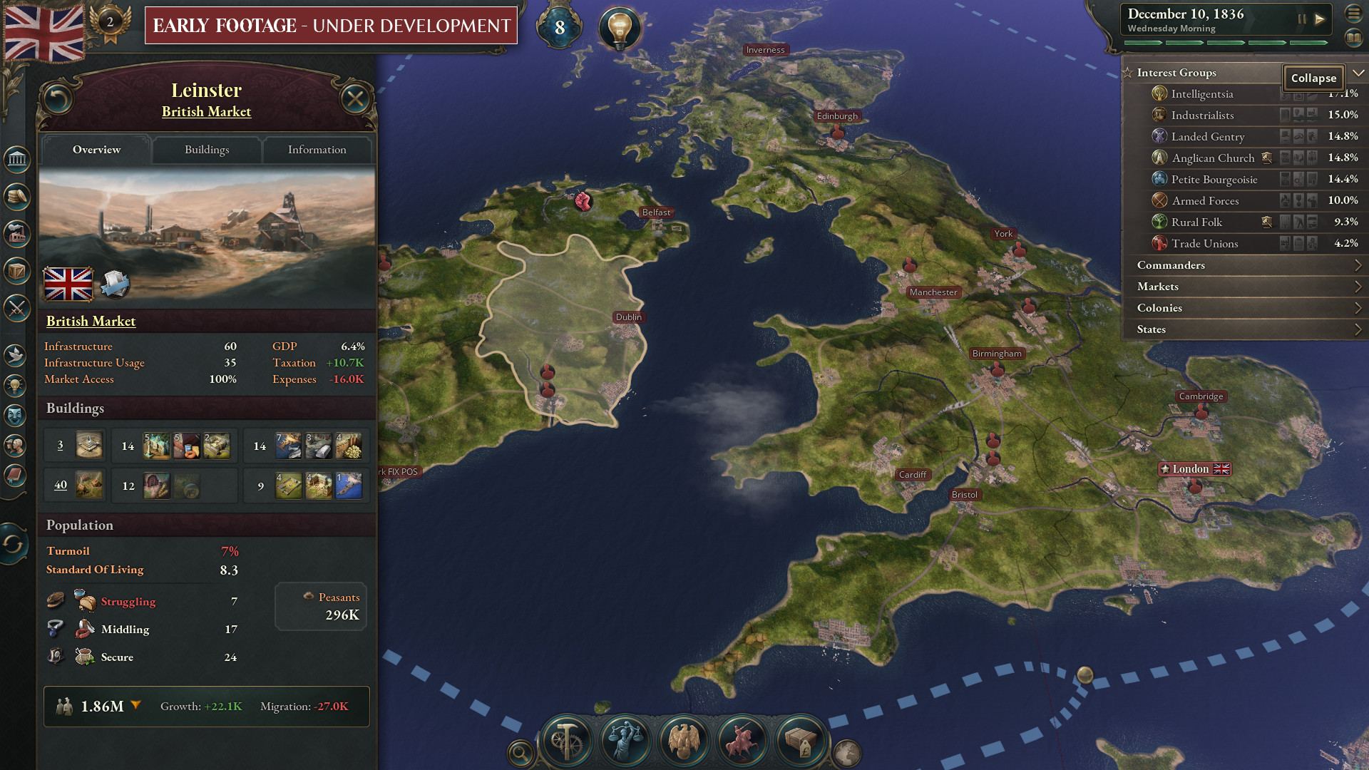
Now most of the time when we talk about Data Visualization in games, especially Paradox Games, the first thing that comes to mind is either line graphs or charts of some kind - giving a visual representation of data instead of just a pure numerical representation on the screen. This is not wrong, but data visualization is not solely about making some form of visual representation of abstract data. It is also about increasing the inherent cognitive understanding of the player by using known trends and patterns that are well established.
An easy example is the capacities, they are color-coded. When things are positive: it's green, when it's bad: it's red. We have a human tendency to impact meaning to color and thus it's a general rule of UX to never use Green and Red unless you are representing Good and Bad.
A quick glance at the capacities bar tells you all you need to know for the moment by color alone, and when you get its tooltip it continues such color coded summarization:
Have any of you whove seen streams or images noticed that this dynamic changes in regards to income? When your nation is in a deficit the balance can show either as white (neutral) or red (bad) in the capacity summary and there is an inherent reason for that?
We do not show a negative income balance as red until it reflects an unhealthy economy, but what do we mean by this? Nations run deficits all the time, but not all deficits are bad, especially those which are investments into the country such as construction. Construction is classified as a temporary national expenditure as opposed to a fixed one, meaning that we calculate your fixed revenue vs expenditure to be positive once the construction is finished, and we keep the income balance showing a neutral tone because of it.
This is to reflect that your money is going down, but the fundamentals are fine. What this allows you to notice is when this fundamental changes and turns red, signaling a larger issue of your economic fundamentals being out of balance that could cause future problems.
We may be losing money now but the fundamentals of the economy are okay if we ever stop building new factories
This is a lot of what we have been trying to iterate on in Victoria 3 at this point in its development: we dont want to just show you the static image of whats going on just that moment but we want you to know the dynamic trends of where the data is going.
What do I mean by this? Well let me give you an example: see our buildings list (to make it clearer about what I am talking about I have gone with the minimized mode - didnt know there was a minimized mode? Now you do!)
[i]Behold the glorious minimized building menu and color-coded gold reserve bars.
(Bars are color coded on regular view as well)[/i]
Before cash reserves were only golden, and you would have to physically watch the bar tick along and hopefully notice the trend of your reserves. The data was still informative but you were only able to easily glance if your business had cash reserves (meaning it could afford a price disruption or could help supplement the investment pool). Now we use the historical data we would normally use to fill out a line graph to color the bar and add trend markers to show if the cash reserves is going up or down, coloring it green or red respectively.
Now at a quick glance you not only see how your economy is doing, but where it is going and you would be amazed at how significant such a small change can be. This is combined with our usage of red, white, and green to symbolize whether productivity is good or bad - to give you further depth of information: sugar industries in this picture are not failing but soon will be if you do not do something about it. Meanwhile the arms industry has stalled outright.
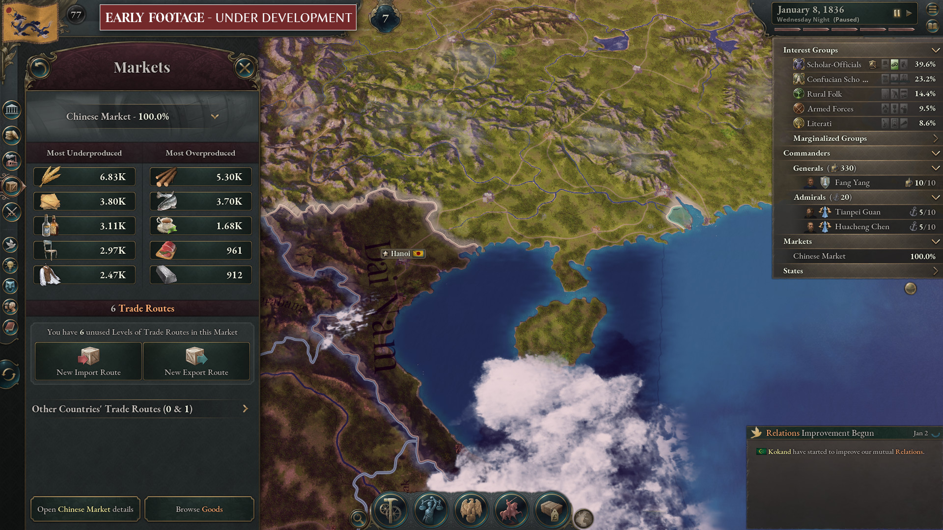
A lot of these data visualization changes, you might never see or notice, because when they work well their understanding becomes second nature, but heres another one I want to call out: we recoloured the market summary tab:
Behold the new Market Panel, with corrected colors and balance bars to show the magnitude of the effect.
The older Market Panel, serviceable but flawed with its data presentation.
Okay we changed like 3 things, I hear you say - but why is that so damn important? Im glad you asked that community strawman heres why.
We removed the Red/Green visualization of the balance and by doing that we helped make our understanding of the market system clearer to the player. Remember, this is Victoria 3, imbalances are not inherently bad. Sometimes maintaining a shortage of a good can be done intentionally to prop up an industry or ensure the wealth of specific pops. (I went into the logic of why for this in my talk at PDXCON and if we are lucky at some point in the future I will get a copy of that up on the forums as well). We found that when we colored the items green/red we were inherently having players react in ways that they themselves found was not always good or what they wanted. In this case, this mostly meant players reacting to red numbers being bad and trying to make the number go green.
We also added balance bars, to help show you the magnitude of what those numbers mean in the scope of its total buy/sell volume and price scale. Can you tell from the old version above what the relative difference to your economy the liquor and sugar shortages are?). By giving more perspective on these offsets from equilibrium we help you better understand the cause and effect of your actions or most importantly; opportunity cost. If merely looking at high prices you might find yourself focusing on furniture or paper, but technically getting food prices lower is shown to have a larger impact on your economy, which is illustrated by the bars below the Balance values. The more blue or gold that bar is, the higher impact that Goods imbalance has on your market. This impact may differ greatly per Good if it is good or bad, but thats up to you to determine.
Thats just a few examples in the game of where we are iterating on data visualization. Mostly because these are the ones I can easily remember and chat about. We are by no means done, Henrik, Aron and myself will continue in the trenches experimenting and iterating on such workflows throughout the game. We look forward to reading your feedback on release and use that to help us prioritize our backlog of ideas.
If you thought this dev diary was a sight to behold, just wait till you hear about the next one, which is the Audio of Victoria 3 which will be written by Franco Freda, our Head of Audio.
Minimum Setup
- OS: TBC
- Processor: TBC
- Graphics: TBCSound Card: TBC
Recommended Setup
- OS: TBC
- Processor: TBC
- Graphics: TBCSound Card: TBC
[ 6487 ]
[ 2143 ]
[ 1910 ]

Time left:
356125 days, 14 hours, 41 minutes

Time left:
356125 days, 14 hours, 41 minutes

Time left:
1 days, 22 hours, 41 minutes

Time left:
1 days, 22 hours, 41 minutes

Time left:
13 days, 22 hours, 41 minutes

Time left:
20 days, 22 hours, 41 minutes

Time left:
13 days, 22 hours, 41 minutes

Time left:
13 days, 22 hours, 41 minutes

Time left:
29 days, 22 hours, 41 minutes
Time left:
0 days, 16 hours, 41 minutes
Time left:
0 days, 16 hours, 41 minutes
Time left:
1 days, 16 hours, 41 minutes
Time left:
2 days, 16 hours, 41 minutes
Time left:
7 days, 16 hours, 41 minutes
Time left:
9 days, 16 hours, 41 minutes
Time left:
13 days, 16 hours, 41 minutes
Time left:
14 days, 16 hours, 41 minutes


